Dr. Fakih
Dr. Fakih® Orthopedic Center is a game-changing orthopedic medical service in Egypt, all in one place, from examination, pain management, physiotherapy, nutrition, and rehabilitation to surgery.
Logo and Brand Identity Design
3 months
Dr. Ahmed Fakih

Overview:
Dr. Fakih Orthopedic Center is a game-changing orthopedic medical service in Egypt, all in one place, from examination, pain management, physiotherapy, nutrition, and rehabilitation to surgery.
The Challenges
The key challenge in this project was ensuring the uniformity of the brand identity across a wide range of uses, including digital media, print materials, and signage. The orthopedic center needed a recognizable and memorable logo that worked on different backgrounds and materials. Additionally, the brand had to cater to both Arabic and English-speaking audiences while maintaining a cohesive design system.
Other challenges were:
The concept of an all-in-one orthopedic center is relatively new in Egypt (totally new in Alexandria), unlike the western world, where almost every state/city has its own orthopedic center.
Most orthopedic doctors in Egypt use logos that focus only on the knee, strengthening the relationship between the knee and the orthopedic field.
The brand needs to feel minimal and modern to stand out, yet looking too minimal or modern might make it feel more expensive, which it shouldn't. It needs to look also affordable.
The Solution
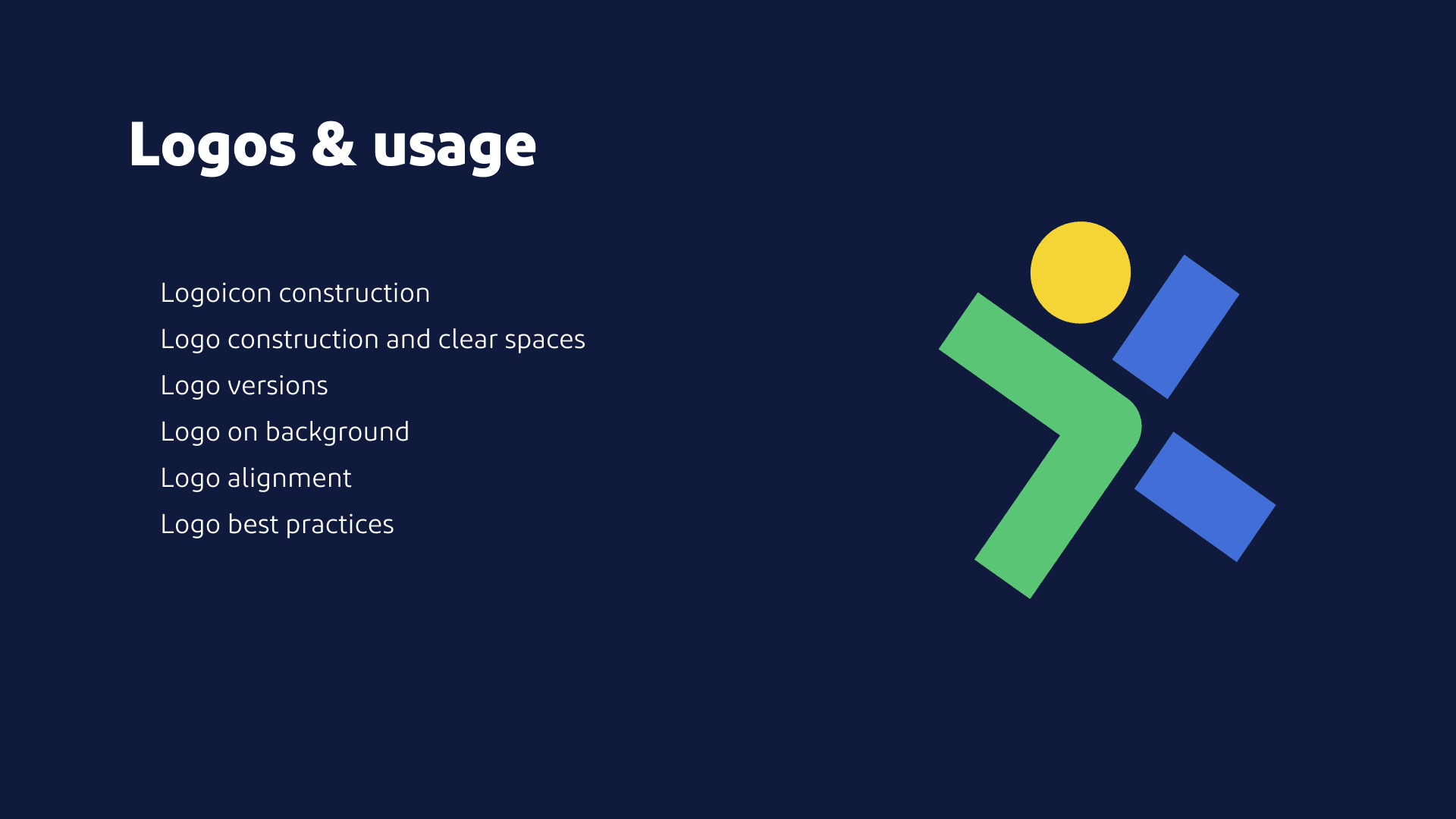
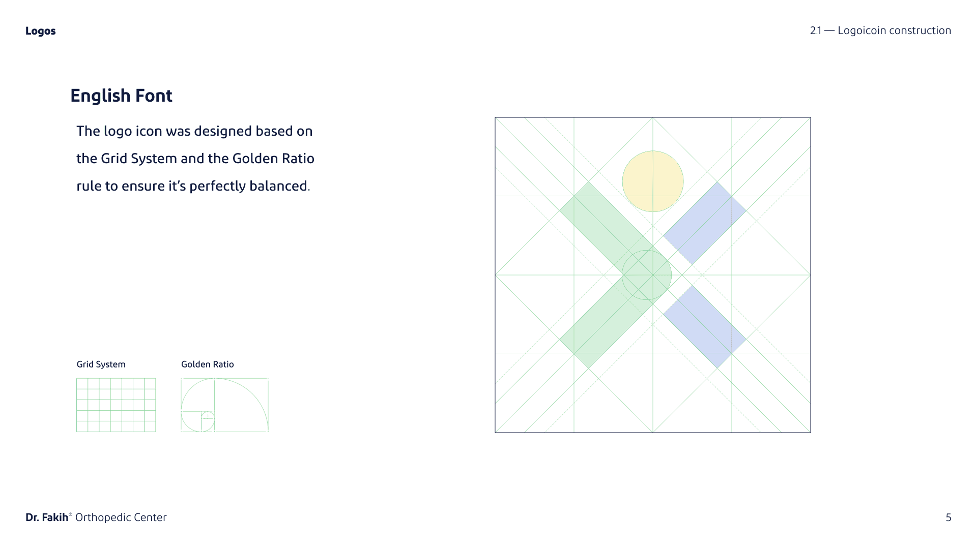
To solve these challenges, we developed a design system based on the principles of the Golden Ratio to create a balanced and visually appealing logo.
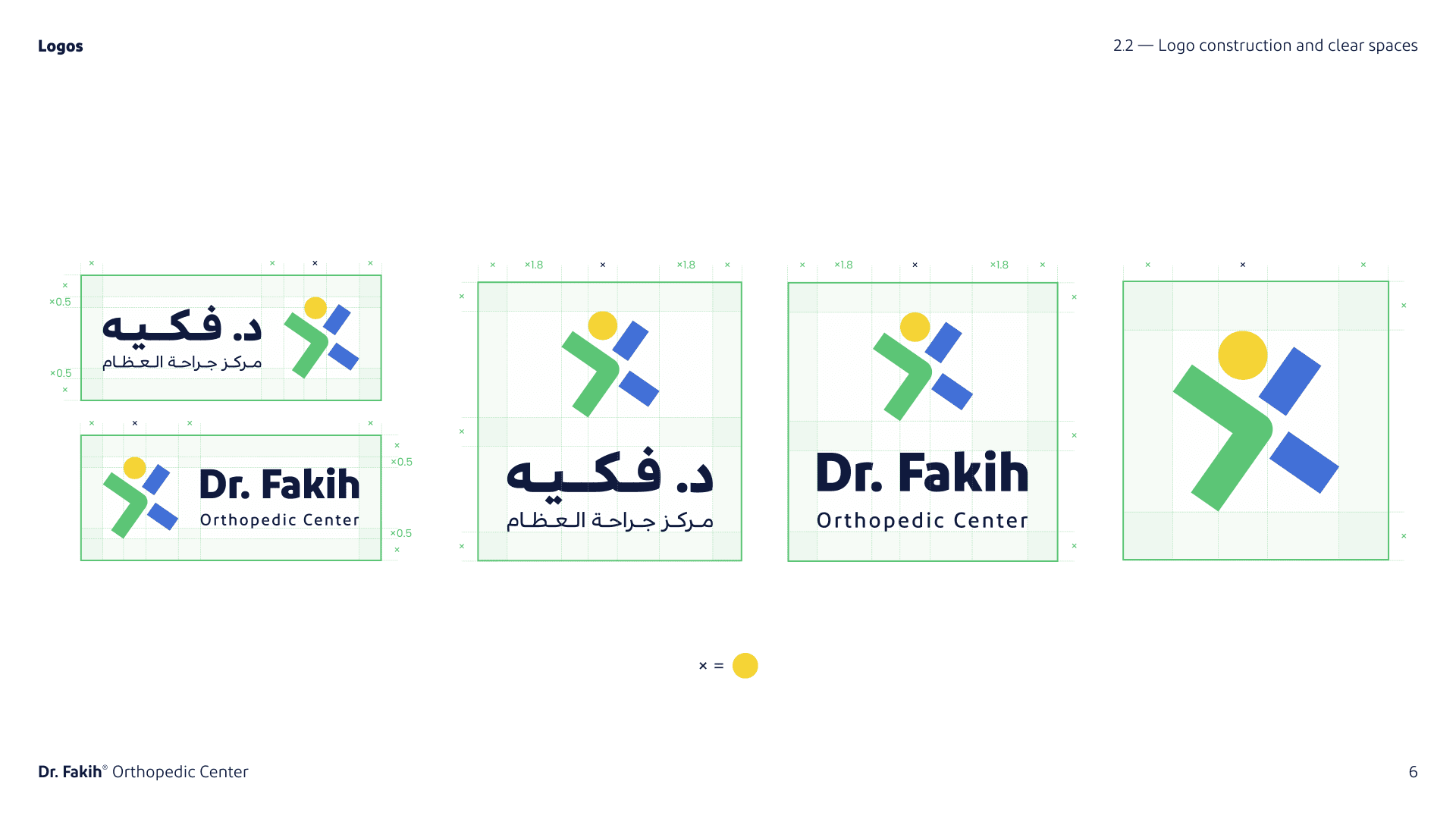
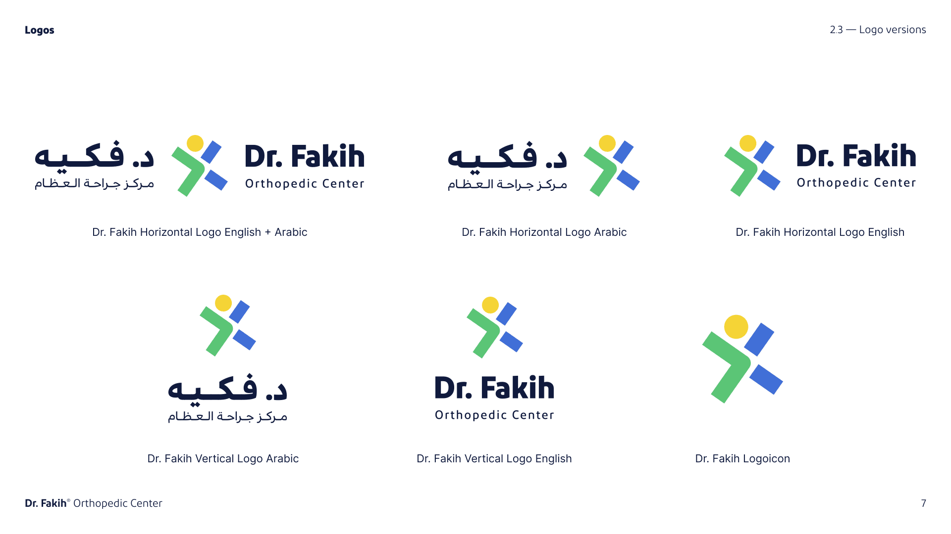
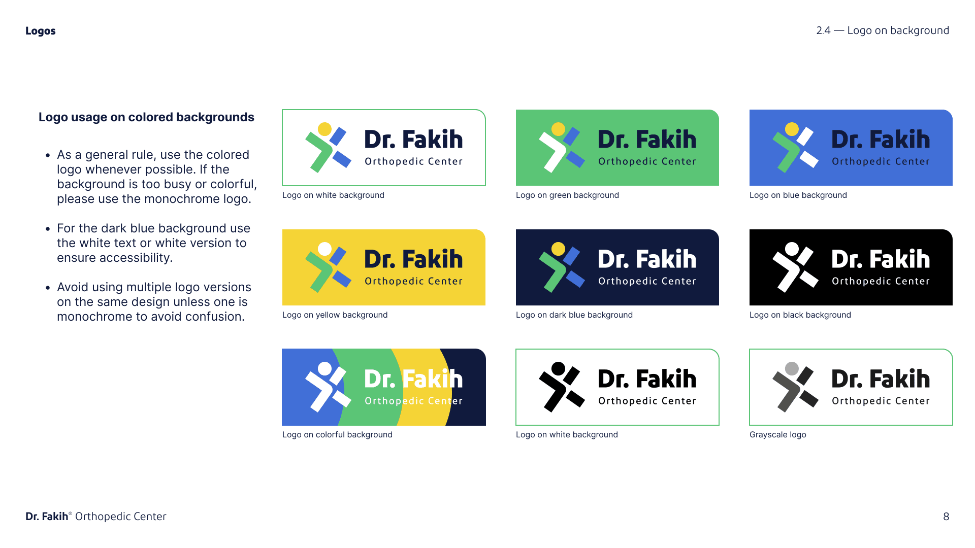
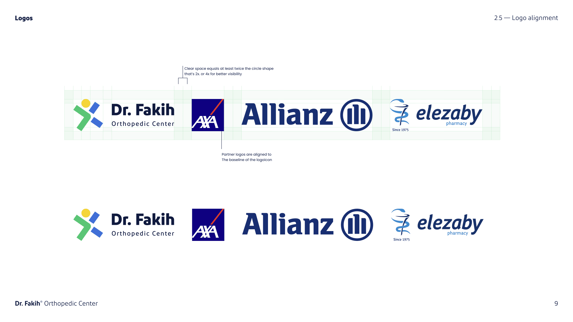
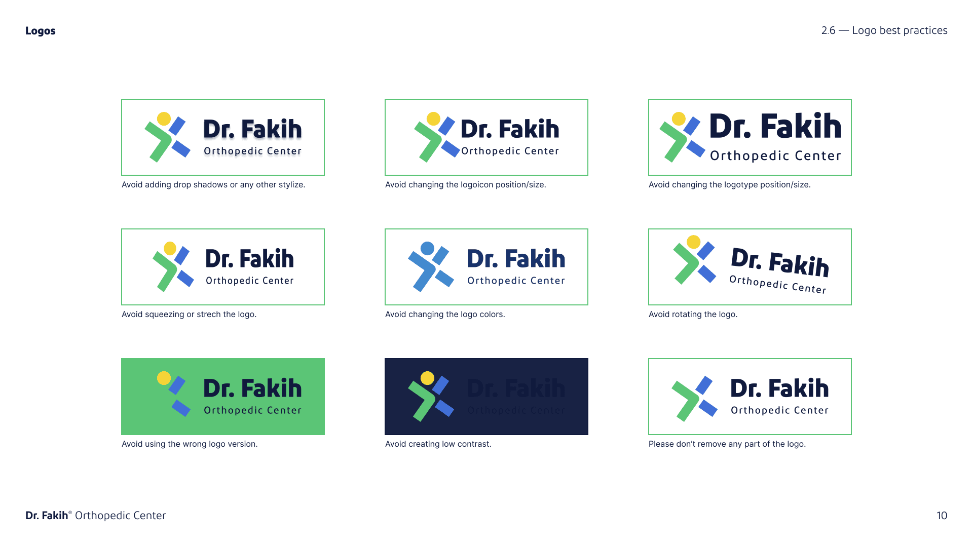
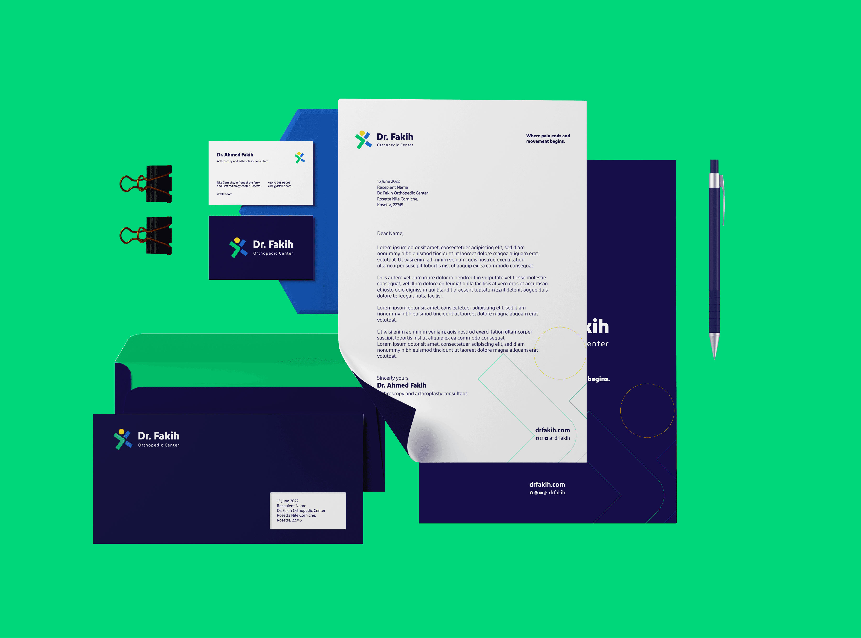
The guidelines included a clear construction of the logo, color palettes, typography, and usage rules. A versatile logo was designed to work well on both light and dark backgrounds, and various versions were created for horizontal and vertical layouts.
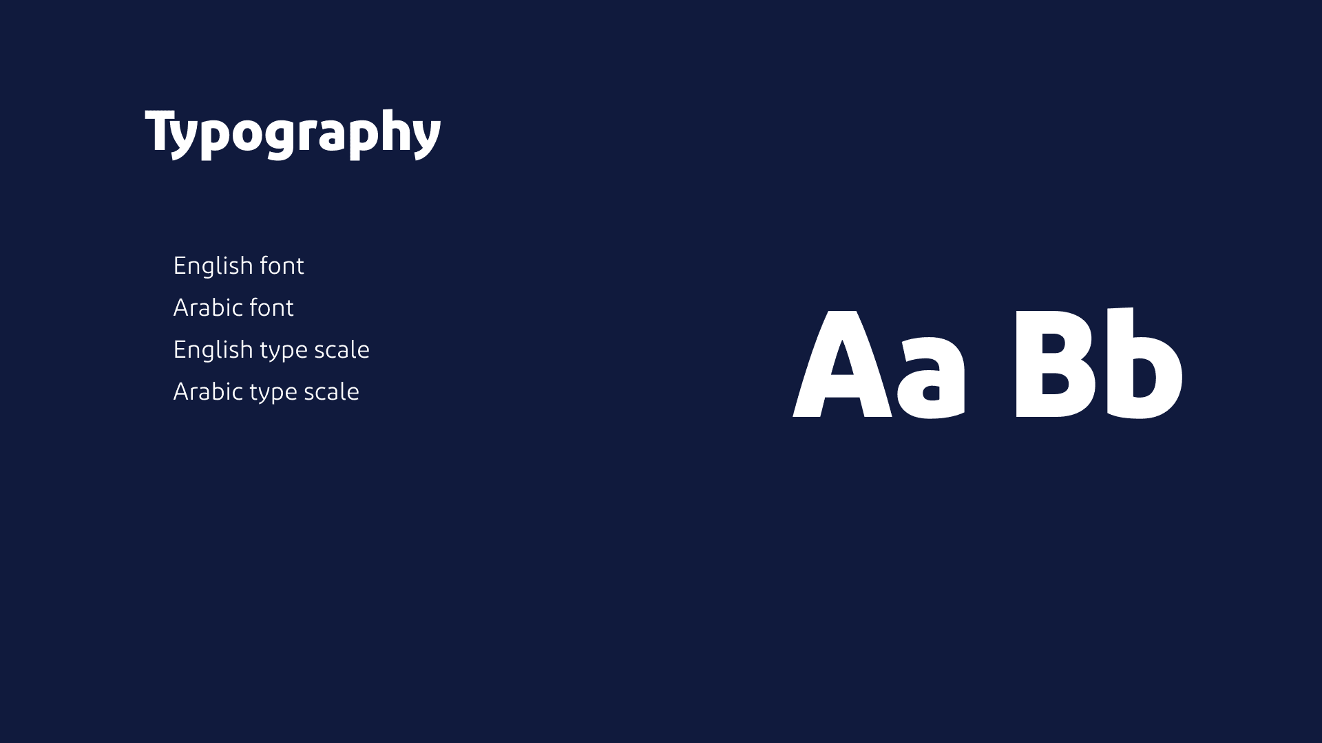
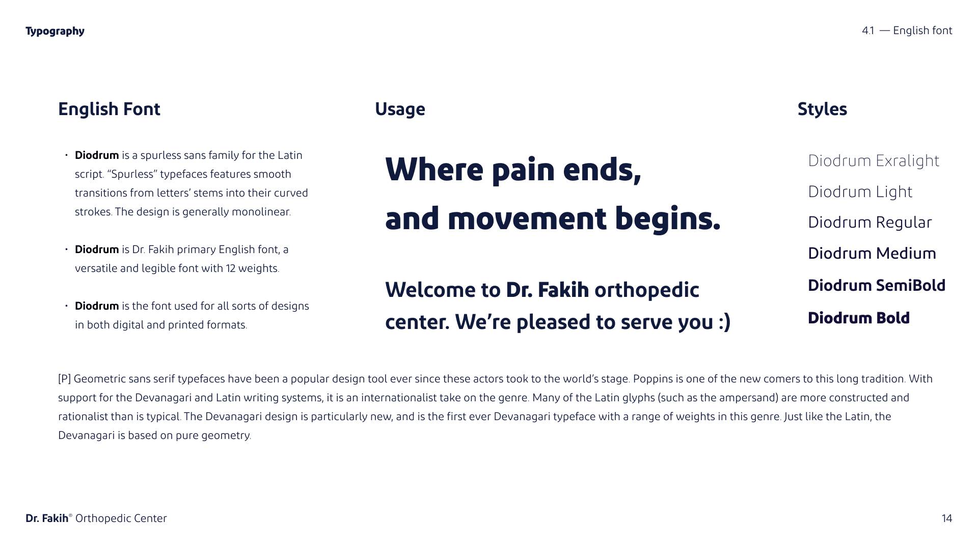
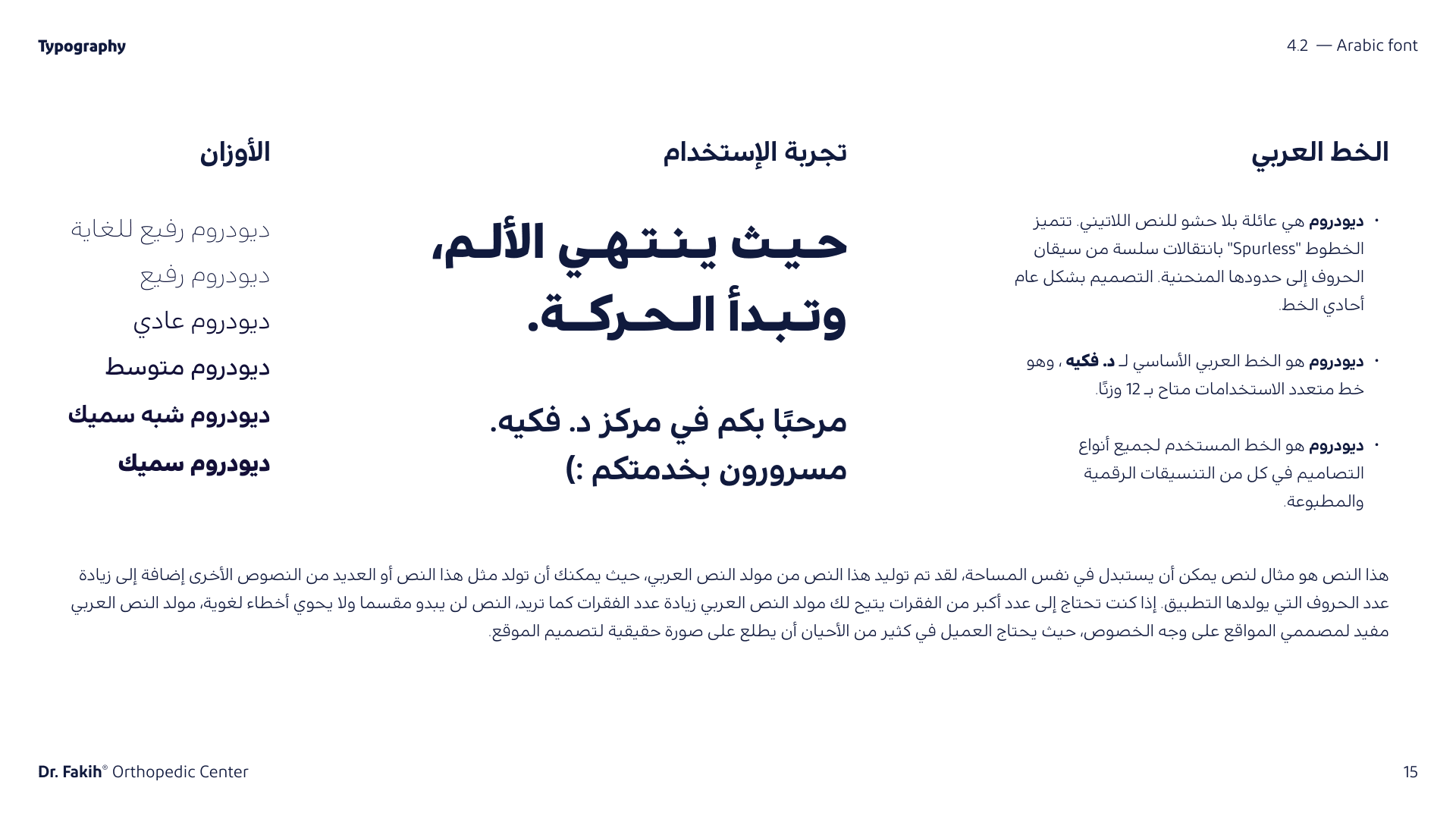
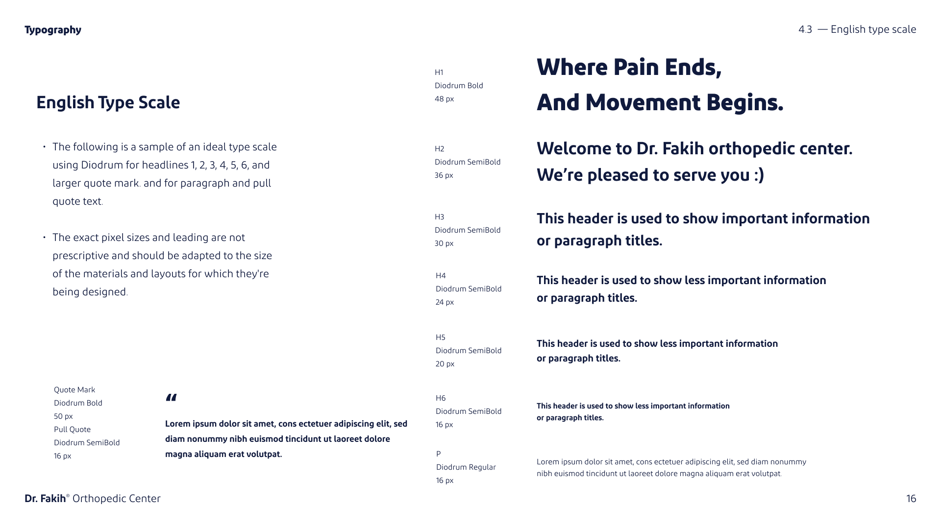
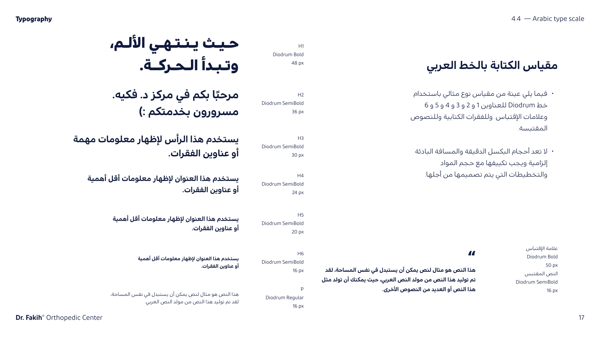
The typography guidelines supported both Arabic and English languages, ensuring the brand was inclusive and accessible to its entire audience.
Design Process:
Research & Discovery: We started by understanding the center’s core values and services, aligning the visual identity with the center’s mission to provide comprehensive orthopedic care.
Logo Design: Using the Golden Ratio and grid systems, we created a balanced logo that could scale across different formats. Special attention was given to ensuring that the logo maintained its clarity in both Arabic and English.
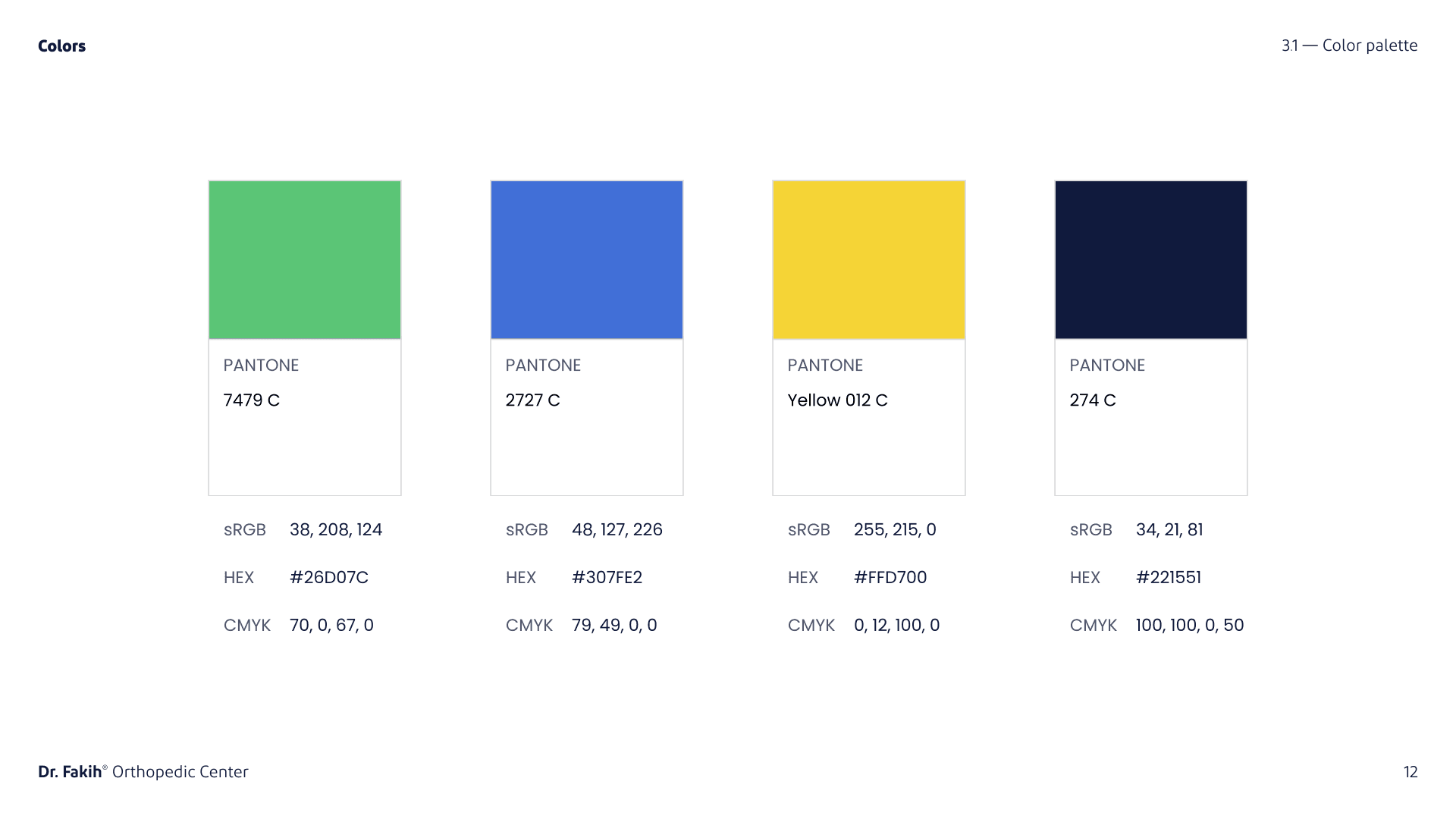
Typography & Colors: We selected the Poppins font family for English and Diodrum for Arabic, ensuring both readability and modern aesthetics. A carefully curated color palette with hues of blue, green, and yellow was chosen to evoke a sense of trust and health.
4. Testing: The logo and brand elements were tested across digital and physical formats to ensure versatility, ensuring the brand was recognizable in all mediums.
The final brand guidelines provided a solid foundation for the Dr. Fakih Orthopedic Center’s visual identity, ensuring consistency in all communication. This cohesive brand identity reinforces the center’s commitment to excellence and makes it easily identifiable in the healthcare market.
